
Northumbria University Logo Type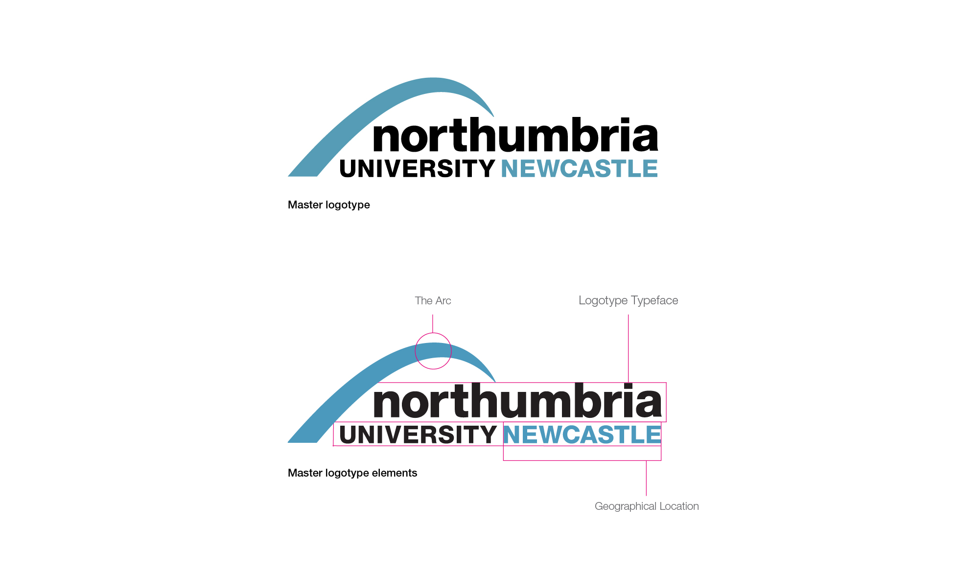 The logotype is made up of the following elements;
- The arc – set in the Northumbria blue, the arc is a development of the original logo into a more modern, dynamic and contemporary shape. Also by reducing the negative space within the arc, we have optimised our visual footprint, this is especially important where space may be restricted
- Typography – The Northumbria University logotype typeface
- Newcastle – The inclusion of the word ‘Newcastle’, set in Northumbria blue, now highlights our geographical location
Northumbria University Logo Colour Version
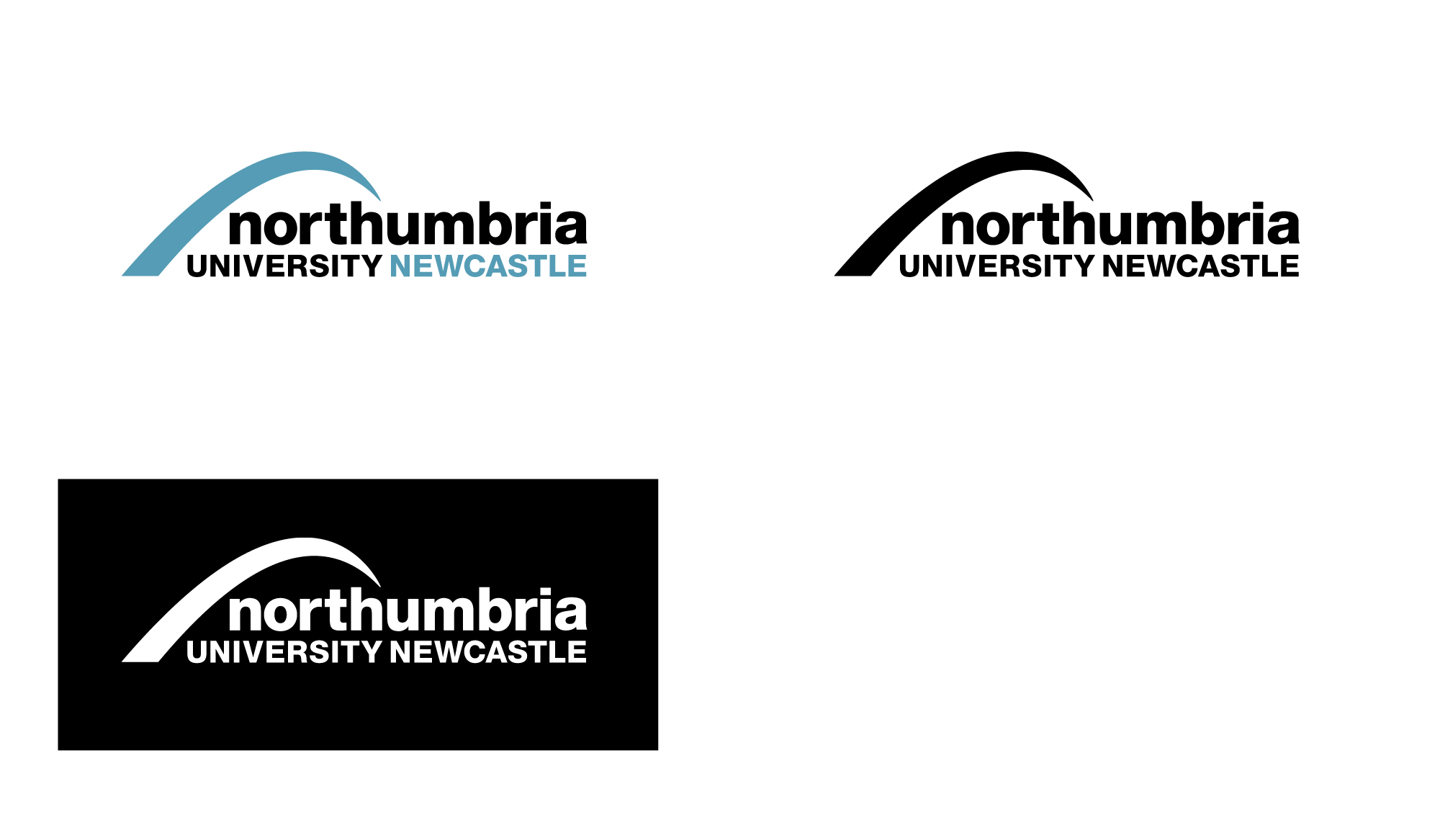
Full Colour Logotype
The full colour version of the logotype should be used wherever possible. It should be applied to ALL customer facing advertising unless prior permission has been given by the brand team.
Only use this logo with a white or tonally light background that affords maximum visibility and legibility.
Black & white Logotype
The black and white version of the logotype should only be used when it is not possible to use the colour version. Only use this logo with a white or tonally light background that affords maximum visibility and legibility.
Reversed Logotype
To be used when it is not possible to use the colour logotype or where the logotype needs to be applied to dark coloured images or backgrounds.
Northumbria University Logo – Do & Don’t
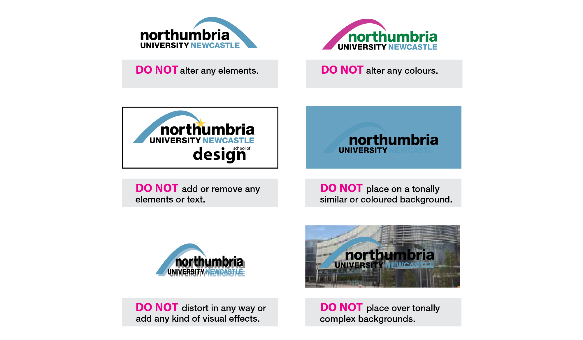
In order to protect our brand identity, it is important that the visual appearance of the logotype remains consistent and legible at all times. The logotype should NEVER be modified, added to, or adjusted in any way and should only be reproduced from master artwork provided by Northumbria Graphics.
Northumbria University Logo – Minimum Size
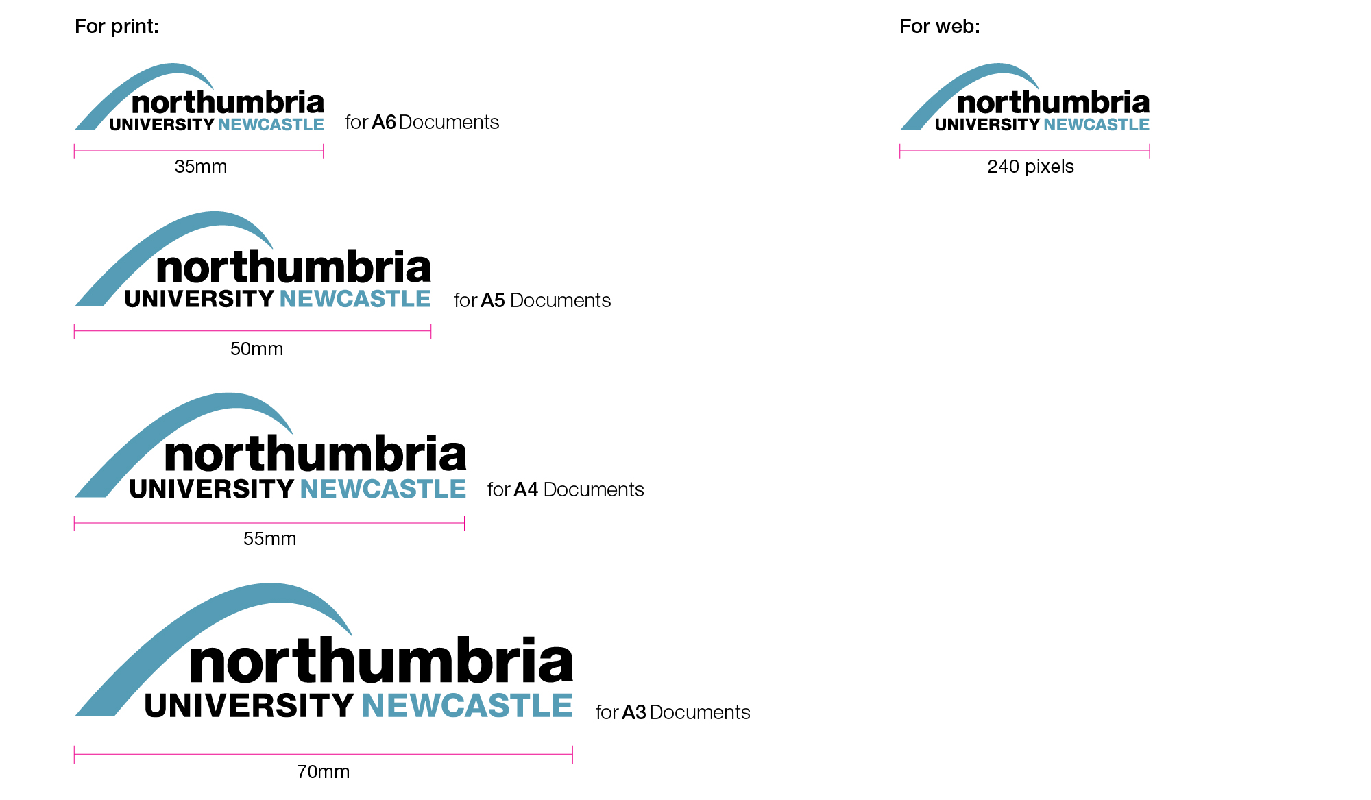
The Northumbria University logotype has recommended usage sizes, these depend on the type and size of the application being created. The size recommendations below are to ensure that the legibility and consistency of the logotype is always maintained. The logotype should never be reproduced below the sizes outlined above.
Northumbria University Logo – Exclusion Zone
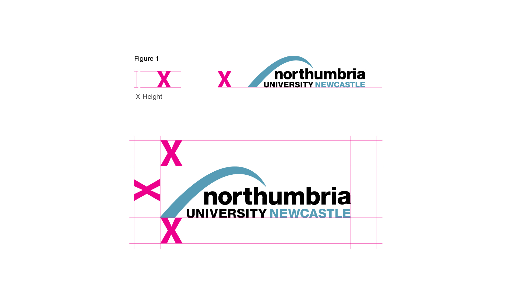
Our logotype needs to be seen clearly. The exclusion zone is there to provide a consistent, protected space around the logotype. The minimum area that needs to remain clear/protected is equal to the X marked in figure 1. Under no circumstances should this area be infringed.
Northumbria University Logo – Colour Palette
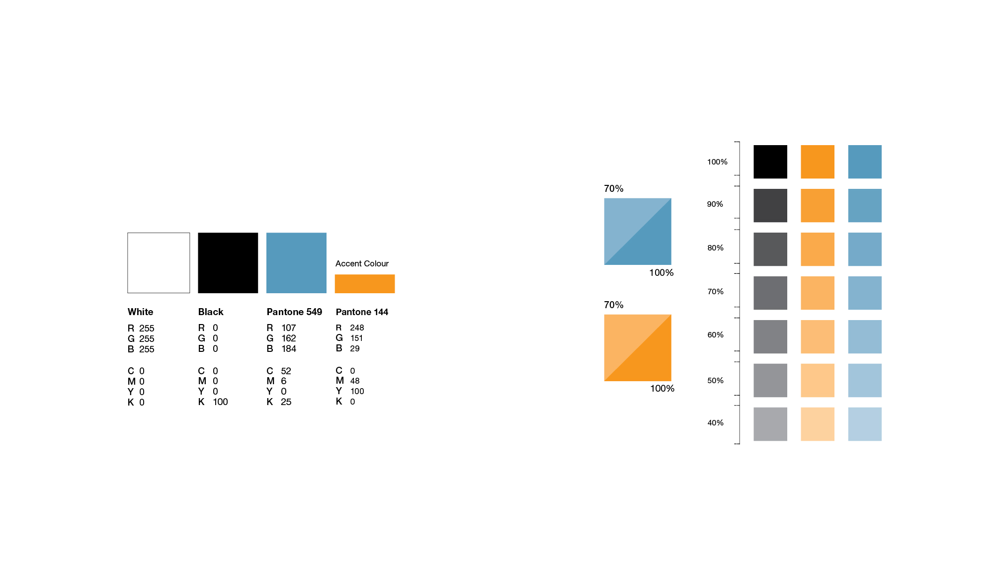
The colour palette has been developed to realign and refresh Northumbria’s existing colour way. White is now the primary colour supported by black and blue as secondary colours. Orange is our accent colour. Above is a guide to the recommended proportions in which the colours should be used throughout all media and communications.
Northumbria University Logo – Font Typeface
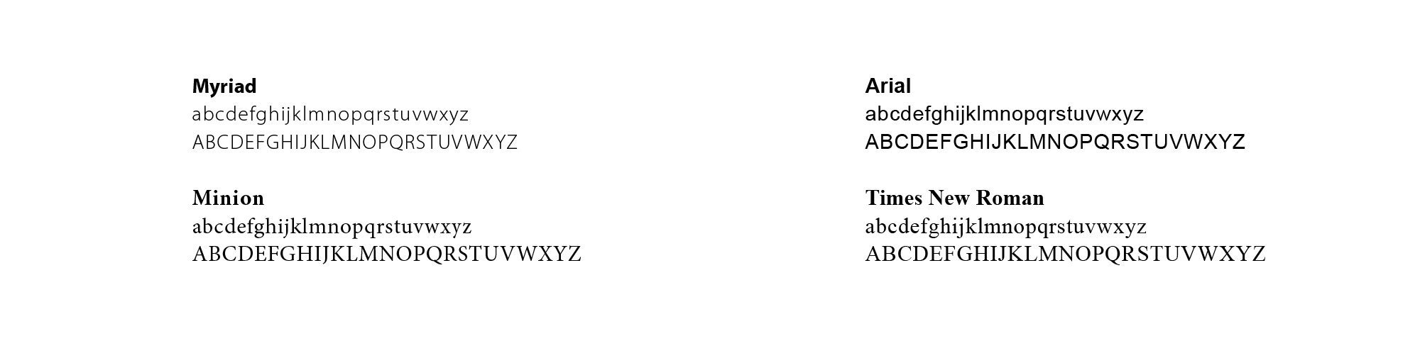
Primary Typefaces
A consistent use of our brand typefaces will immediately deliver familiarity.
Myriad
For Printed Materials:
Use the Myriad family for display type and headline/titles. For documents that are not copy heavy it can also be considered for setting body copy.
For online use;
Use the Myriad family for all requirements online.
Minion
For Printed Materials:
Predominantly Minion should be considered for setting body copy where documents are especially copy heavy. It’s comprehensive glyph and ligature palette make it ideal for manuals, accounts and other documents with a large page count.
For online use:
Do not use minion online.
Secondary Typefaces
Myriad and Minion are specialist fonts and may not be readily available on all colleagues computers. When this is the case please use the following fonts for internal collateral ONLY, e.g. PowerPoint slides and email.
Arial
For Printed Materials;
Use the Arial family for display type and headline/titles. For documents that are not copy heavy it can also be considered for setting body copy.
Times New Roman
For Printed Materials;
The Times family should be considered for body copy on larger page count documents and for setting letters.
Northumbria University Logo – Visual Style
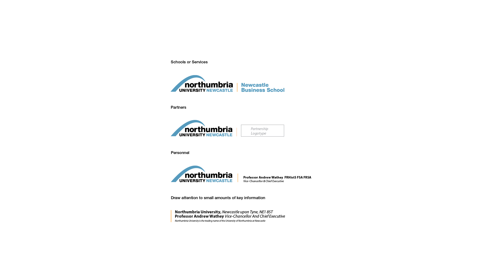
Visual Rule Divide
The visual rule divide is predominantly used as a device to both set apart and link the main Northumbria University logotype to:
- Schools or Services
- Partners
- Personnel
- Draw attention to information/call to action
Draw attention to small amounts of key information.
The visual rule divide should always appear in the brand orange colour and should be of an appropriate stroke weight that is suitably sympathetic to the design.
Page architecture.
Rules can be used in the general architecture and layout of a page to aid in separating information. In this scenario the rules should only appear as black or tints of black. This is the same principle when using either vertical or horizontal rules.
Orange should NEVER be used for rules in general page architecture and layout, as this would draw too much attention to the negative spaces between elements and therefore goes against the rationale of our accent colour.