
VIDEO BRAND & STYLE GUIDE
Logo Introduction
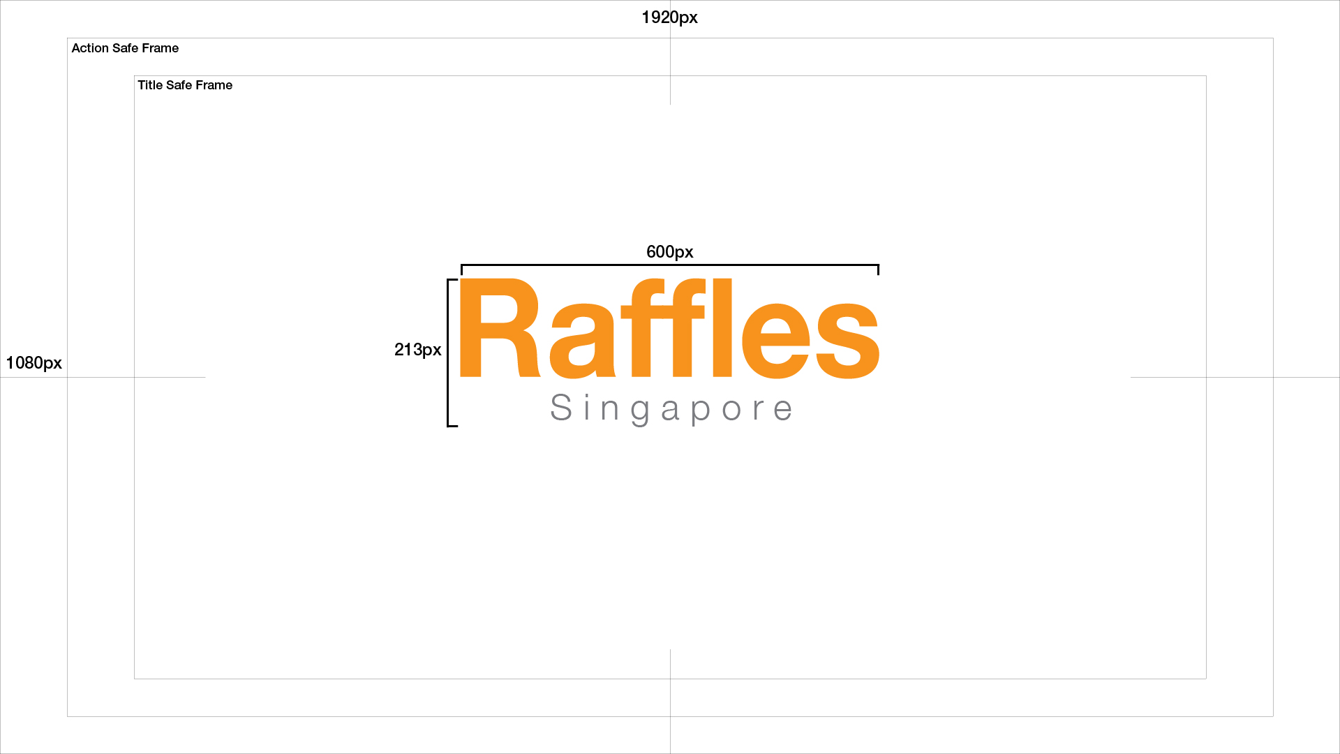
Every video should start with our corporate title font on a white background and subtly faded in from the centre. Please note that the double f’s in ‘Raffles’ should be touching each other. The entire duration should be 3 seconds long and have a lead of 10 between lines.
Corporate Typography:
Font Type: Helvetica Bold
Font Size: 195
Tracking: -5
Face Colour: #F08C00 (Orange)
City Typography:
Font Type: Helvetica Light
Font Size: 51
Tracking: The city name should be centered between the letters ‘a’ and ‘e’ of Raffles.
Face Colour: #6E6E73 (Gray)
Raffles Water Mark
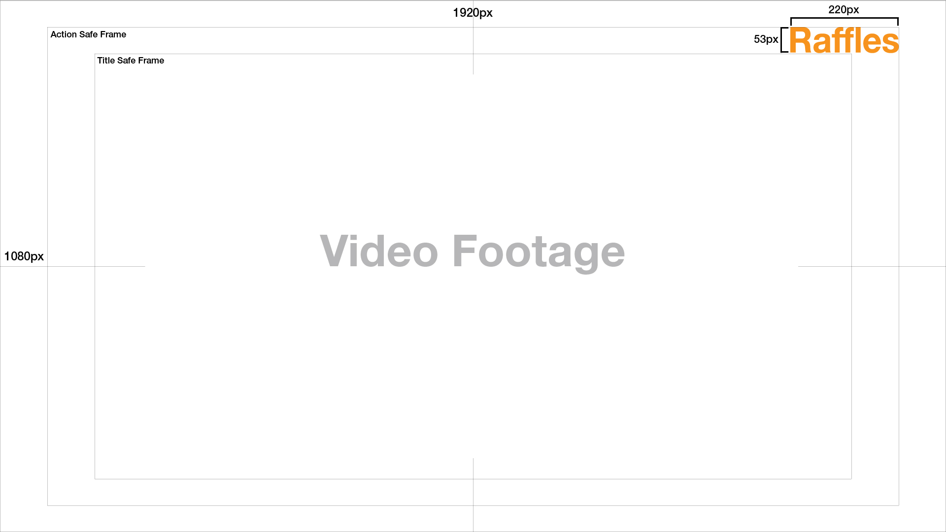
Raffles water mark should be displayed within the top right hand corner of the action safe frame. All videos produced by Raffles should display a “Raffles” water mark as a representation for our branding.
Video Lower Third
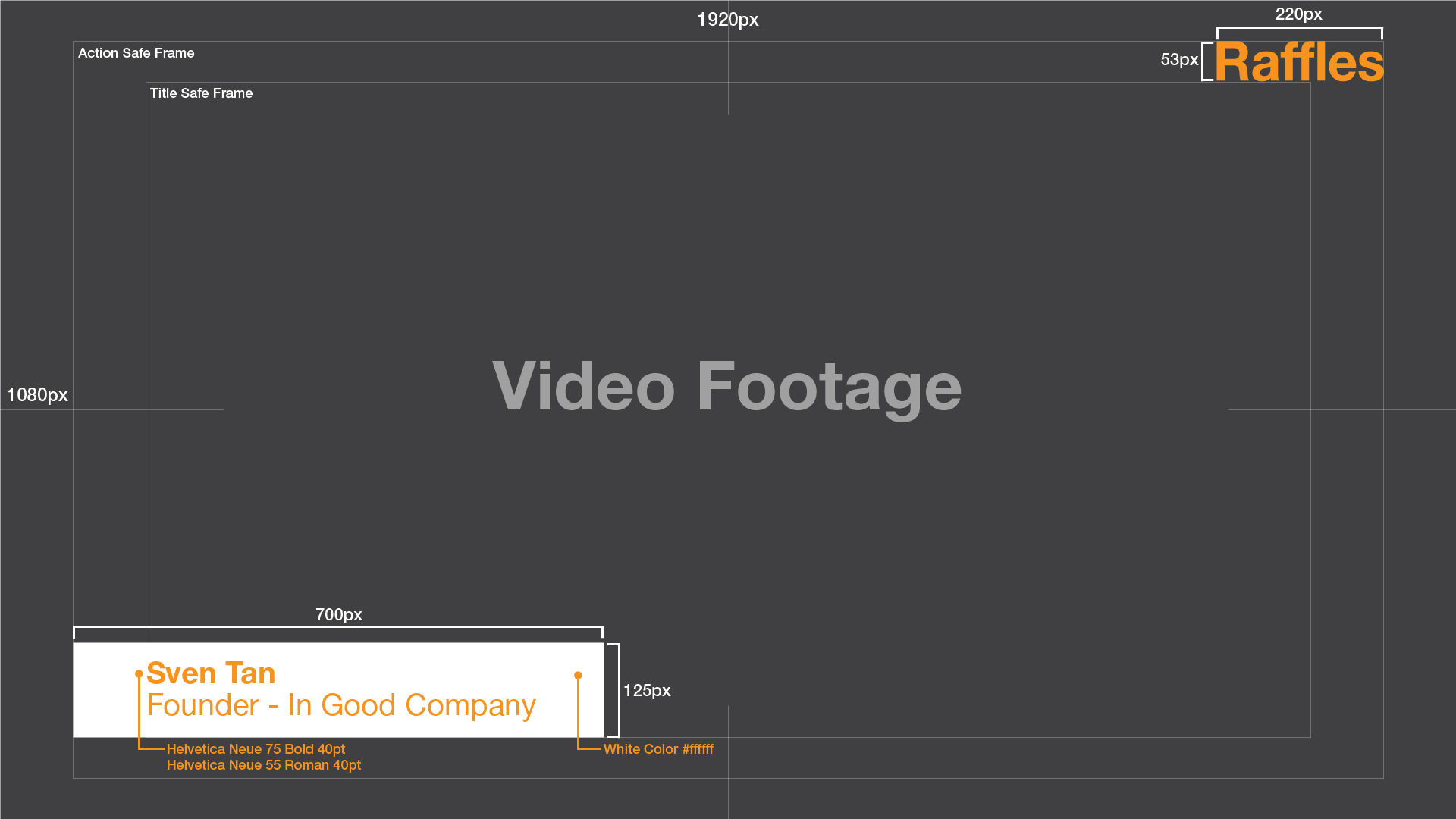
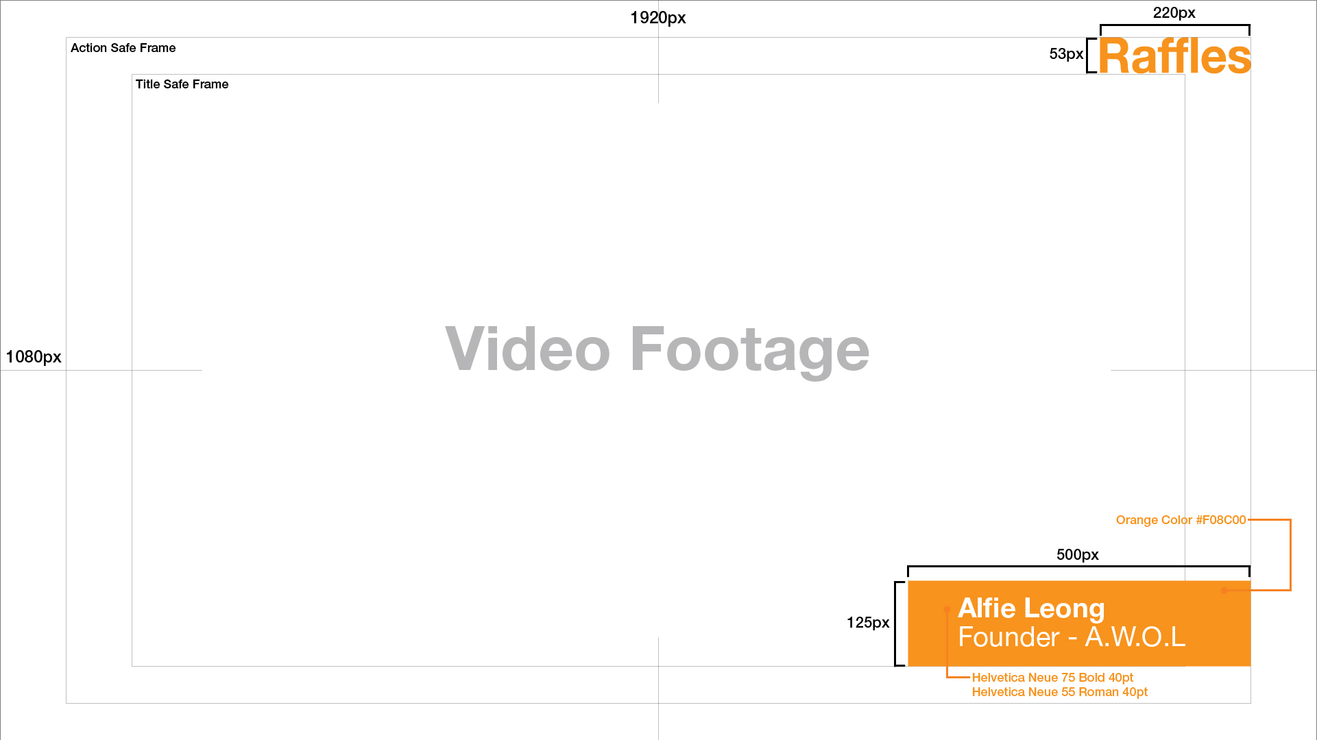
Lower thirds should be left justified or right justified
Lower Third 1:
Font Type: Helvetica Neue 75 Bold
Font Size: 40
Tracking: 0
Or
Lower Third 2:
Font Type: Helvetica Neue 55 Roman
Font Size: 40
Tracking: 0
And have a lead of 10 between lines.
Text should be centered in no more than two small colored bars that float in the lower left or lower right corner of the video. Bar and font colors should be either #F08C00 (Orange), #6E6E73(Gray) or #FFFFFF (White).
Bars should briefly fade in and fade out. We strongly discourage any further lower thirds animation.
Transitions
In video and film, transition effects have meaning. As such, transition effects should be used sparingly and limited to cuts and fades. Should you want to use a text slide transition, it should be on a white background using Helvetica Regular font in #F08C00 (Orange).
Closer
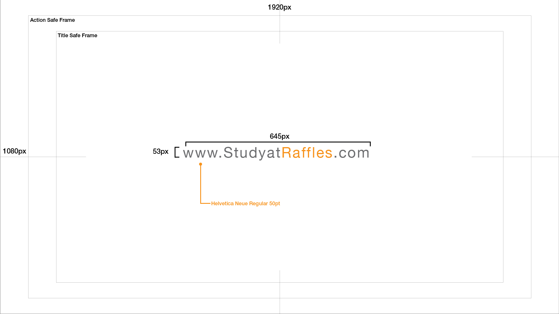
Every video ends with a call-to-action to visit www.StudyatRaffles.com, in our corporate font and colour, on a clean white background.
Kindly download templates for all style guides here (Right Click and Save As).